dim_dateDimension
Data Analyst · Data Scientist · Product Analytics
Hi, I'm Daniel. I turn data into decisions.
Data is everywhere. Actionable insights aren't. I use analytics, AI, and automation to help businesses cut through the noise, optimizing processes, predicting outcomes, and turning data into a competitive edge.
A little about me
Curious about the question behind the number.
Most companies have more data than they know what to do with. I help them figure out what matters, automate the boring parts, and make sure insights actually get used.
What I do
Analysis, visualization, and data products
Tools change. The goal stays the same: make data understandable and useful.
Data Analysis
Clean, explore, segment, and interrogate datasets to uncover patterns, trends, and opportunities.
Python · SQL · BigQuery · ExcelDashboards & Storytelling
Build interactive reporting experiences that make complex business questions easy to explore.
Power BI · Looker Studio . MatplotlibMachine Learning & Data Engineering
Apply statistical and ML techniques and design cloud workflows for reliable, scalable data.
Airbyte · GCP · AWS · ETLData model
Good decisions start with good data structure
Before a dashboard can answer the right questions, the data behind it needs to be structured correctly. A well-designed data model connects business processes, keeps metrics consistent, and makes reporting easier to scale.
Reliable metrics
A consistent structure reduces conflicting numbers across reports and gives teams a dependable foundation for analysis.
Connected information
Sales, products, locations, supervisors, and dates can be analyzed together instead of living in disconnected reports.
Scalable reporting
A well-structured model makes it easier to add data and build new dashboards without rebuilding the reporting foundation.
Explore the model: click a table or field to see its relationships.
dim_productDimension
fact_salesFact table
dim_locationDimension
dim_supervisorDimension
Why this matters: the model sits between the business question and the dashboard. It is the foundation that makes analysis consistent, explainable, and easier to extend.
Selected work
Projects I've worked on
A collection of analysis, dashboards, machine-learning projects, and data pipelines.
Looker Studio Dashboards
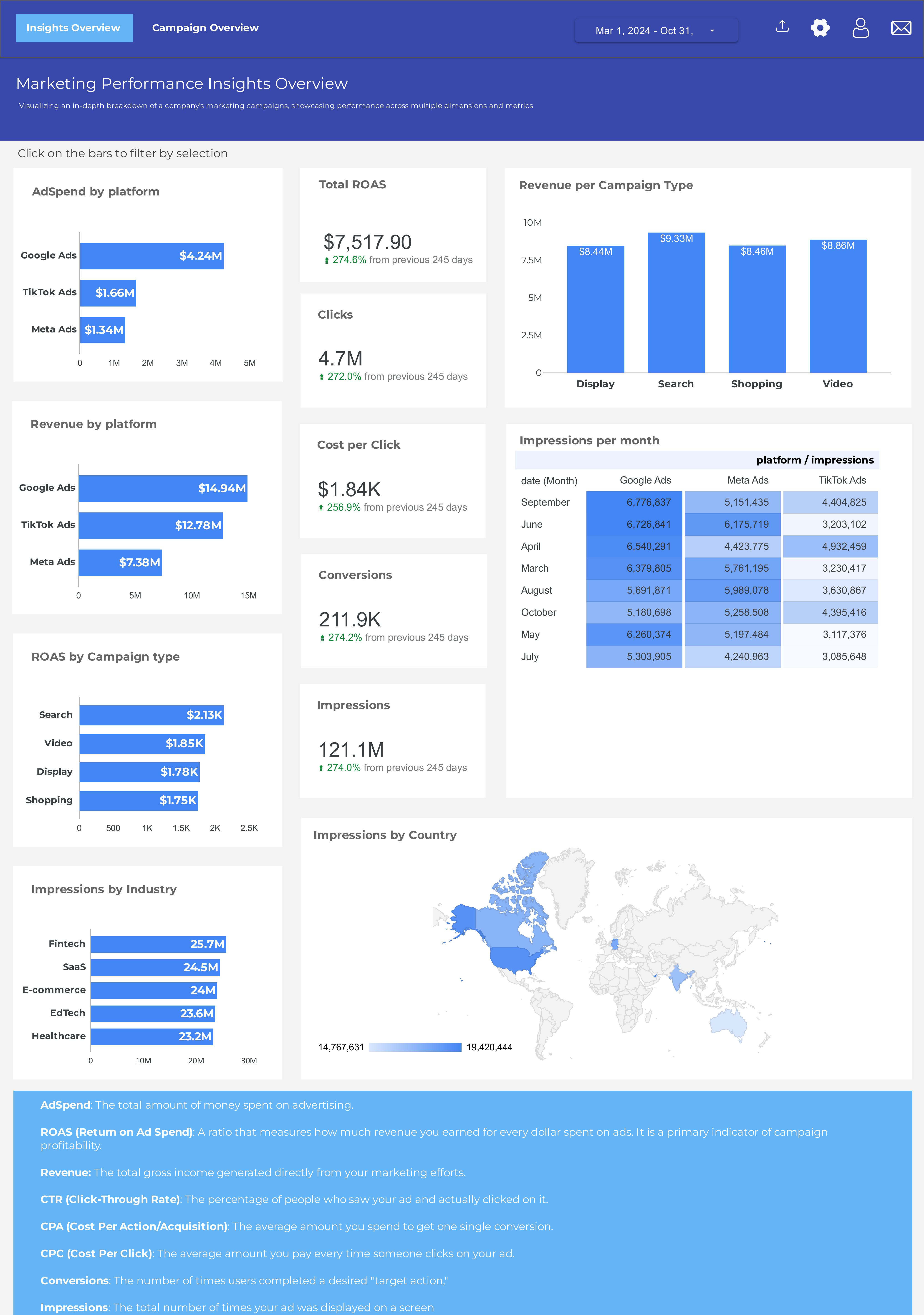
Ads Campaign Dashboard
An interactive advertising performance dashboard designed to evaluate campaign effectiveness and return on advertising investment. It provides insights into ad spend, ROAS, campaign types, impressions, and other campaign performance indicators.
Looker Studio Dashboards
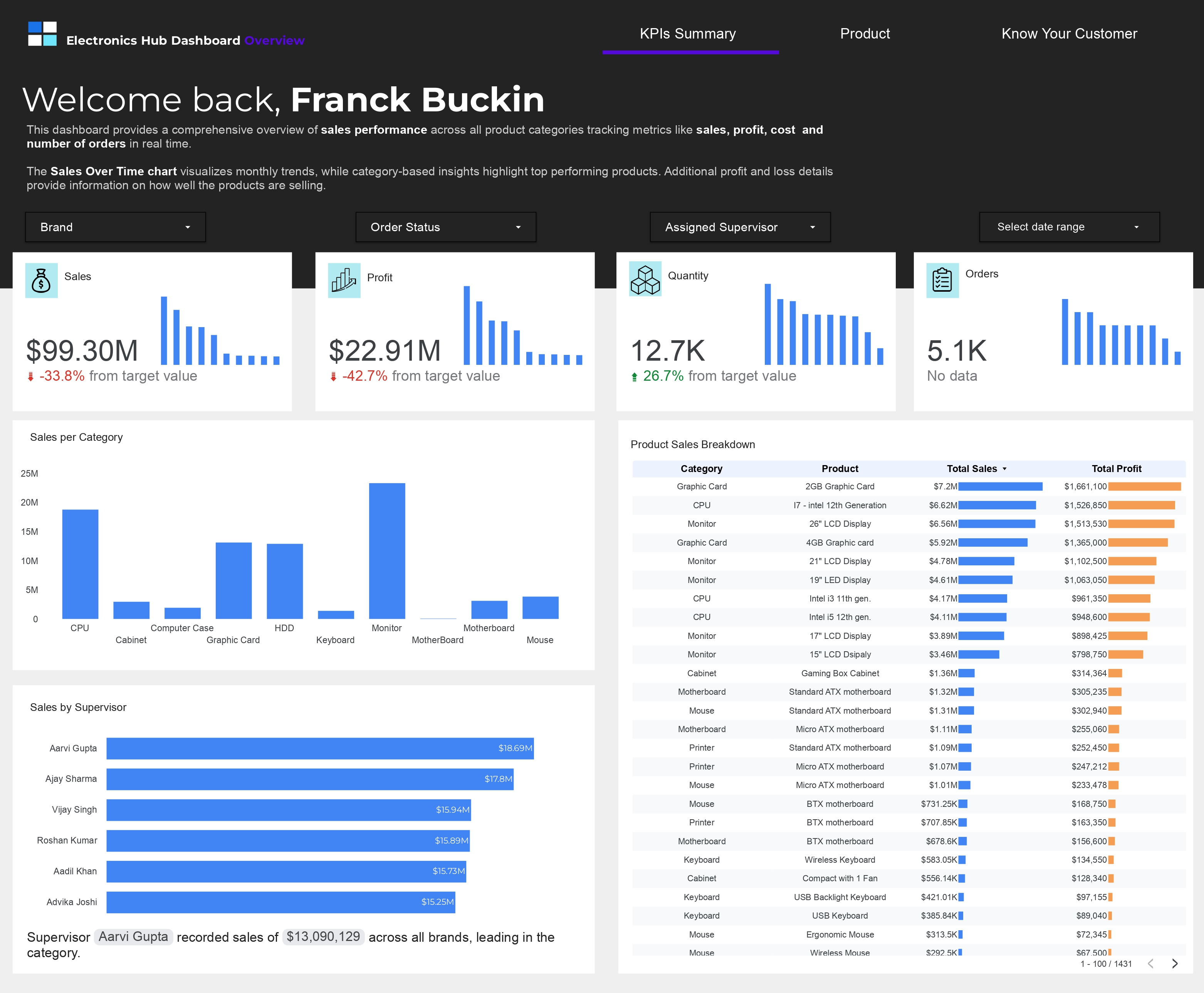
Electronics Hub Dashboard
A comprehensive Looker Studio dashboard designed to analyze and visualize sales performance across electronics product categories in real time. The dashboard tracks key metrics including sales volume ($99.30M), profit ($22.91M), cost ($76.38M), and order volume (5.1K units), with detailed breakdowns by product category, brand performance, and supervisor productivity analysis.

Power BI Dashboards
Power BI dashboard: Analyzing Africa's Tech Funding Landscape
This Power BI dashboard provides an in-depth analysis of Africa's tech funding landscape from 2010 to 2023. It highlights key metrics, including $13.6B in total funding, $7.14B in latest sector funding, and the dominance of Life Sciences with $2.1B in recent investments. Explore sectoral trends, funding distribution, and insights into investor impact across the continent..
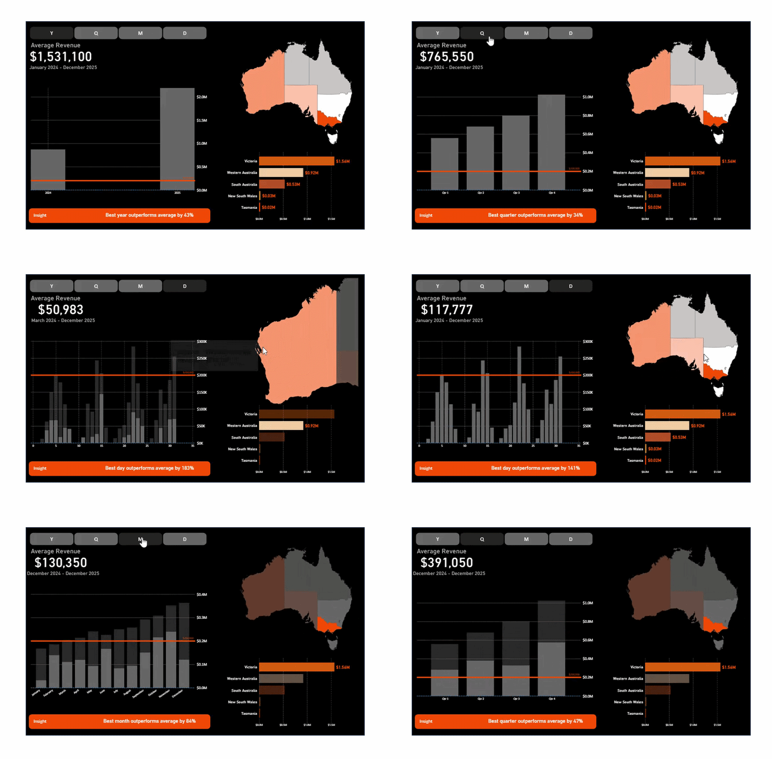
Revenue Dashboard · Power BI
Average revenue, regional trends & 43% outperformance insight
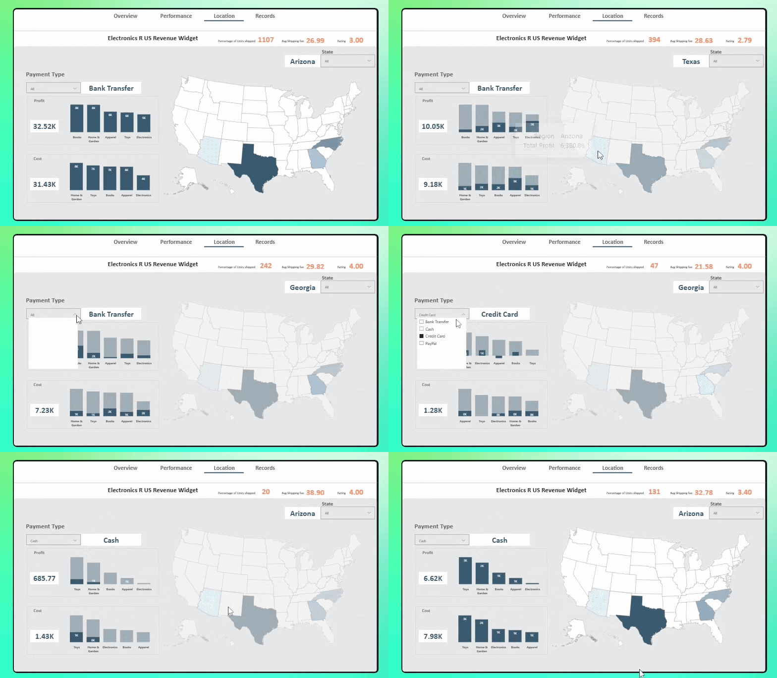
Map Widget · Location Dashboard
1,107 units · $32.5K profit · State filtering
Power BI Dashboards
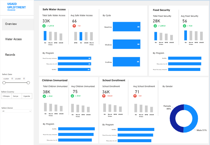
USAID Upliftment Program Dashboard
An interactive Power BI dashboard designed to monitor key indicators from the USAID Upliftment Program, providing insights into safe water access, food security, child immunization, and other program outcomes.
Operational reporting
From raw records to clearer decisions.
01
Raw records
Collect
02
Transform
Prepare
03
Analyze
Interpret
04
Decisions
Deliver
100+
Locations
Live
Insights
AI + Data Engineering
AI-Powered Operational Reporting & Delivery Pipeline
This project automates the creation of personalized operational reports from structured performance data, then delivers those reports directly to stakeholders/Field workers through the channels they already use,eliminating manual reporting work and ensuring insights reach the right people faster. The system ingests raw records, aggregates metrics by individual and location, calculates key performance trends, and uses a large language model to transform structured data into clear, actionable narrative summaries. The final output is a polished PDF report delivered directly via API to the relevant stakeholders.
Python / ML
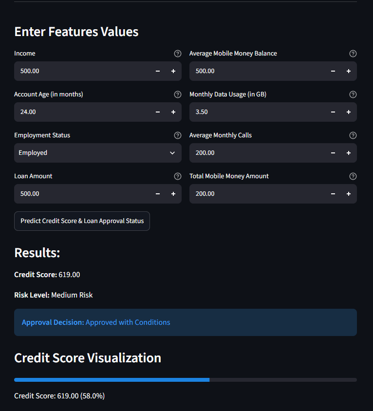
Credit Scoring Analysis & Model for People Without Traditional Banking
This project involved developing a credit scoring system for individuals lacking access to traditional banking, leveraging alternative data sources like mobile phone usage, utility payments, and community-based lending behavior. The model used Random Forest to predict creditworthiness, achieving an accuracy of 60%. The analysis highlighted the potential for financial inclusion for traditionally underserved populations.

Cloud / Data Engineering
Global Dynamics of Illicit Drug Supply and Markets
An in-depth analysis of global illicit drug supply chains, focusing on opioids, amphetamines, and cocaine, with insights into youth usage trends, production hotspots, and socio-economic impacts.
Cloud / Data Engineering
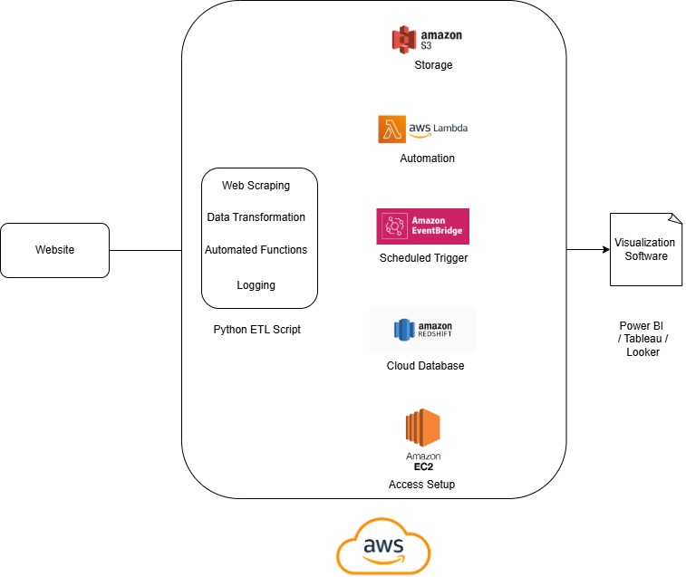
Cloud Data Pipeline for Real-Time Semiconductor Market Analysis
An automated cloud data pipeline to extract, transform, and visualize semiconductor market data using AWS services and Power BI.

Power BI Dashboards
Power BI dashboard: Analyzing Retail Camera Sales / Revenue / Profit
This Power BI dashboard involved analyzing sales, revenue, and units sold data for an electronics retail store across 4 countries, with a focus on uncovering trends and actionable insights to optimize operational efficiency and decision-making.

Power BI Dashboards
Power BI dashboard: Purchase Orders Analysis
A comprehensive Power BI visualizing pending purchase orders (billing/receipt) to identify delays, vendor performance, and trends, enabling actionable insights for procurement efficiency
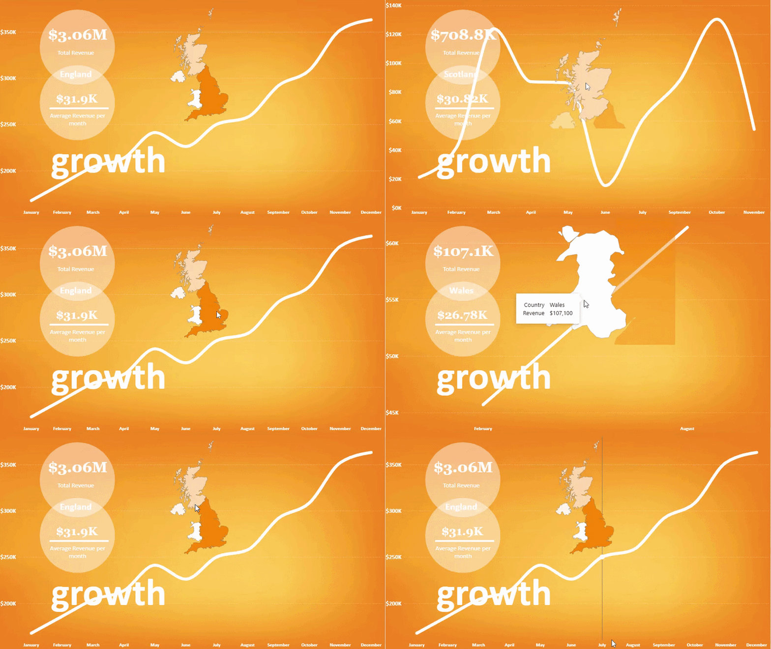
The Growth Story
$3.06M total · $31K avg/month · England leads at $350K
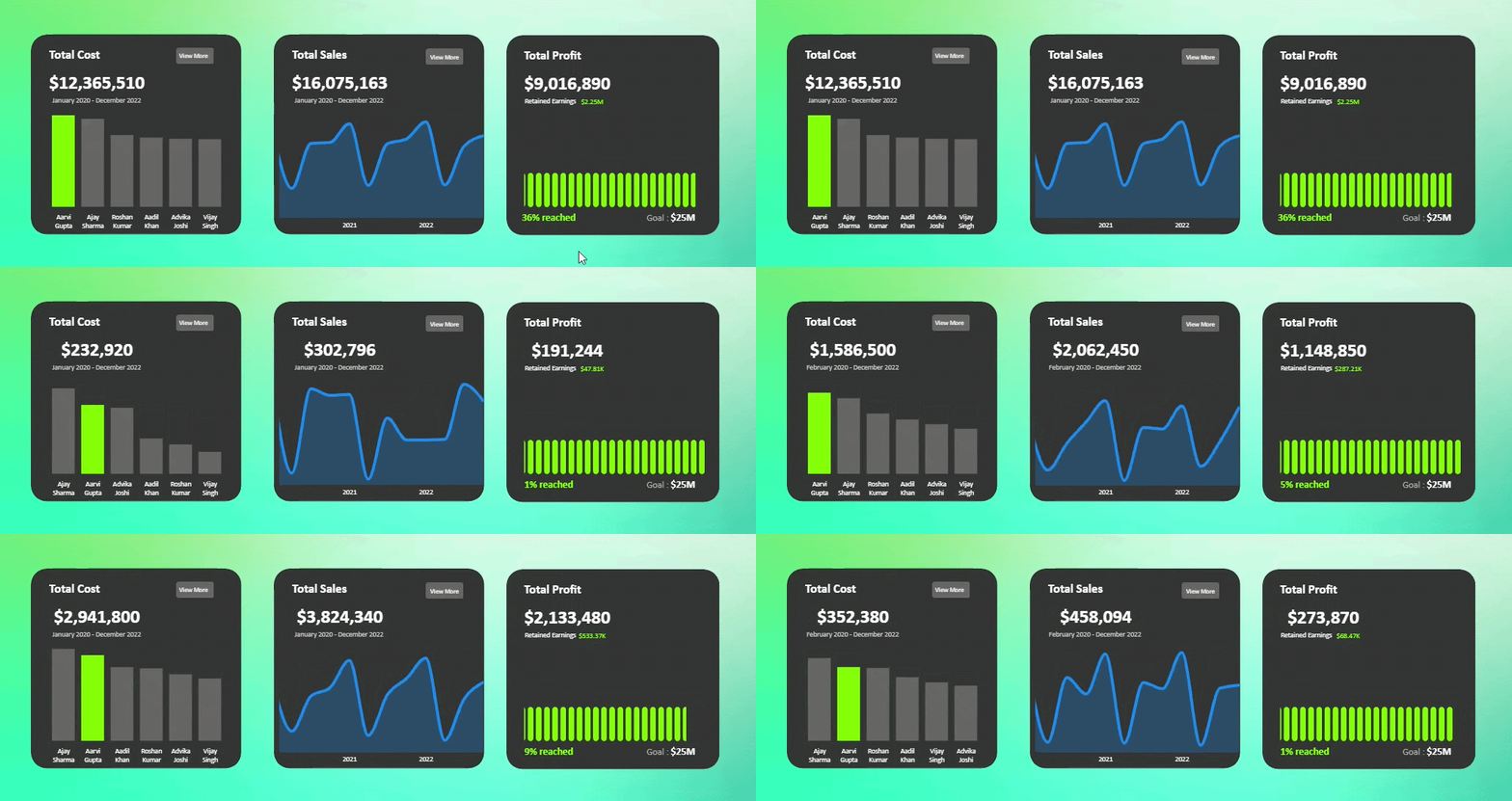
Modern KPI Cards
$16.1M Sales · $12.4M Cost · $9.0M Profit · Web-inspired design

Power BI Dashboards
Power BI Infographic Report: Global Displacement and Climate Impact 2023
This project leverages data from the Internal Displacement Monitoring Centre (IDMC) to analyze global displacement trends caused by natural disasters from 2008 to 2023. Through interactive Power BI dashboards, it showcases key insights, including the displacement of 13 million people in 2023, flood-induced displacements averaging 127,000 per event, and significant regional disparities like Sudan's rate being three times the global average. The analysis aims to support climate justice initiatives and enhance understanding of the human impact of environmental crises.

Power BI Dashboards
Power BI Automobile Fuel Consumption Analysis & Visualization
This Power BI project focuses on analyzing fuel consumption trends within an automobile dataset. Leveraging interactive visualizations, the report explores key metrics such as MPG (Miles Per Gallon), horsepower, and fuel type distribution across various car models and manufacturers

Python / ML
Data Science Jobs Trend Analysis & Prediction with Decision Trees & KNN Clustering
Conducted an analysis of data science job listings from job baords to predict role categories and identify trends in the industry. This project aimed to assist hiring managers/stakeholders in efficiently categorizing job roles and understanding the key attributes associated with various positions

Python / ML
Fuel Consumption & C02 Emissions Analysis & Prediction + Multiple Linear Regression
Performed an analysis of automobile fuel consumption and CO2 emissions to predict emission levels based on various factors. The project aimed to identify key contributors to fuel efficiency and environmental impact of CO2 emissions, aiding manufacturers and policymakers in making informed decisions.

Python / ML
Semi-Arid Farming Analysis: Rainwater Harvesting Impact
Python data analysis of the impact of rainwater harvesting systems on crop yields and drought resilience in semi-arid farming regions. The analysis provides insights into effective water management strategies.
Python / ML
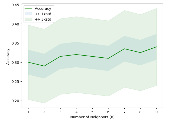
Telecommunications Customer Segmentation + KNN Clustering
This project aims to classify customers of a telecommunications provider into four predefined service usage groups using demographic data. By predicting group membership with K-Nearest Neighbors (KNN), the company can tailor offers for individual prospective customers.

Looker Studio
Looker Studio dashboard: Visualizing revenue, sales , profit etc for Fast food items sold
This Looker Studio dashboard involved analyzing sales, revenue, costs, and profitability data for a fast food chain across multiple locations, with a focus on uncovering trends and actionable insights to optimize operational efficiency and decision-making.

Other
PharmaCrest Financial Analysis & Revenue Forecasting
This project presents an in-depth financial analysis of PharmaCrest, using Python to predict revenue trends. The analysis includes key financial performance indicators, including revenue, cost of production, variance, budgeting, and forecasting. This exploratory data analysis (EDA) was enhanced using ARIMA and Random Forest models to predict future revenue trends based on historical data.
More detail
Want to explore the visuals?
See dashboards, reports, charts, and visual analyses in one place.
Start a conversation
Have a data question or project in mind?
Let's talk about the problem you're trying to solve and how data can help.