The Growth Story: Revenue Across Months & Markets
A visual narrative that transforms monthly revenue data into a clear story about growth patterns, regional performance, and business momentum.
The story behind the numbers
Every business has a growth story, but the narrative often gets lost in spreadsheets and raw data. This visual story was created to bring revenue data to life — making the patterns, milestones, and regional dynamics instantly understandable to anyone looking at it.
The visual narrative answers three core questions that every business leader asks:
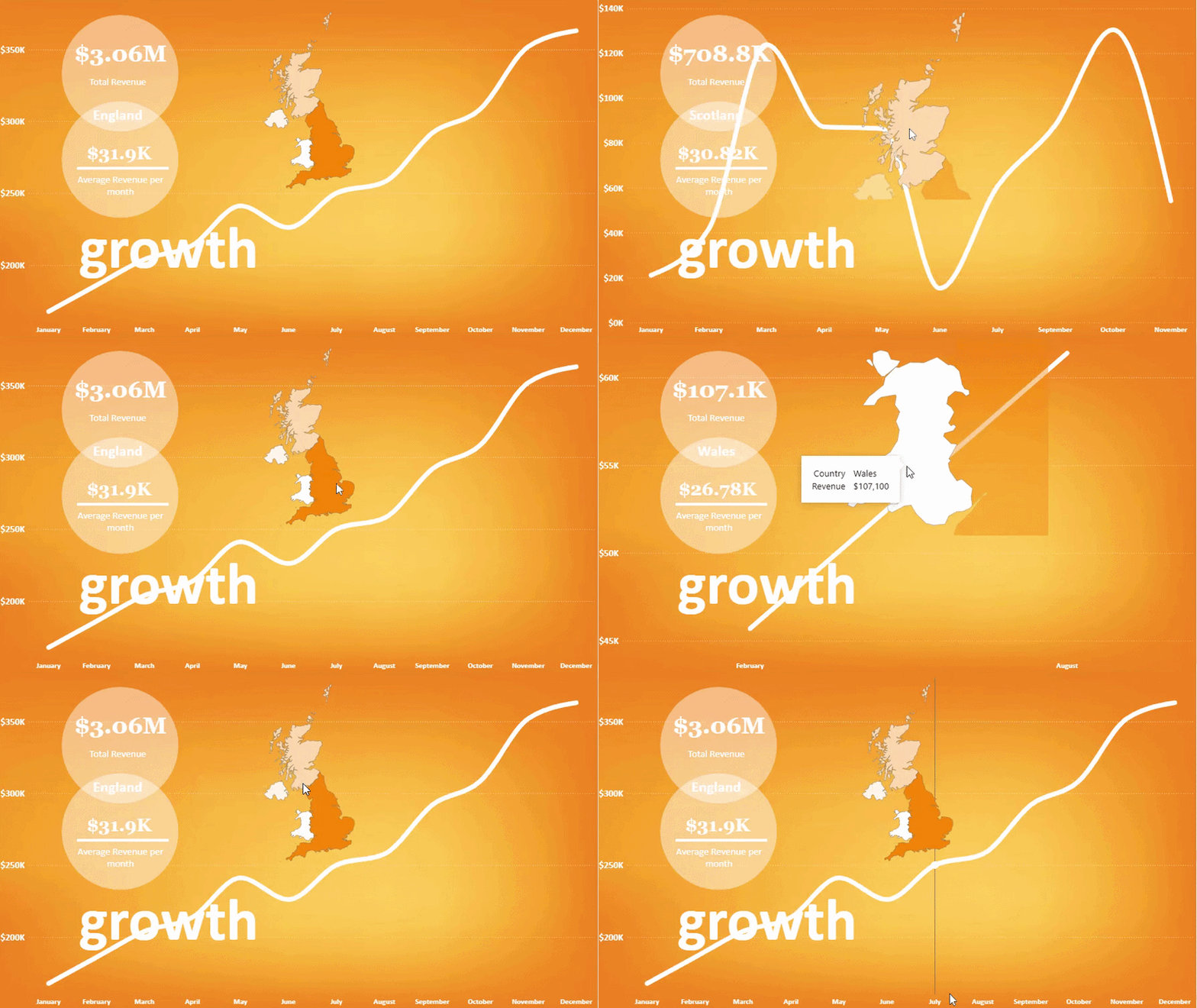
- How are we growing overall? — The upward trend from January to December tells a clear story of momentum, with the line chart showing the journey month by month.
- Where is our strongest market? — England stands out at $350K, telling a story about regional opportunity and market strength.
- What's our baseline performance? — At $31K average revenue per month, there's a clear benchmark to measure against.
The narrative arc
This visual story is structured to guide the viewer from the big picture down to specific insights:
- Opening frame: Total revenue of $3.06M immediately establishes scale and captures attention.
- Building tension: The monthly line chart shows the journey — where growth happened, where it slowed, and the overall trajectory.
- Key reveal: England's $350K contribution is highlighted, adding context about regional concentration.
- Closing insight: The $31K average per month provides a reference point for evaluating future performance.
Visual design choices
- Color hierarchy: The revenue line uses a bold color to draw attention to the growth trajectory, while England's bar is subtly highlighted to emphasize regional significance.
- KPI cards: Three key numbers (total revenue, England revenue, average per month) are displayed prominently to anchor the story.
- Sequential flow: The visual layout guides the eye from total revenue → monthly trend → regional breakdown → average insight.
- White space: Clean, uncluttered design ensures the data speaks for itself without visual noise.
Tools & approach
Looker Studio · Data visualization principles · Visual storytelling · Narrative design · Google Sheets
Explore the visual story
See how data transforms into narrative — view the complete visual story or adapt the template for your own growth narratives.
Start a conversation
Have a data question or project in mind?
Let's talk about the problem you're trying to solve and how data can help.